Images and Videos
Add static images, responsive media, or immersive video backgrounds with ease.
Image Alt Text
The alt attribute in the img tag must always be defined. It provides fallback text that appears if the image fails to load.
More importantly, alt text describes the content or purpose of the image, making it accessible to screen readers used by visually impaired users. This is a key requirement for web accessibility compliance.
Additionally alt text supports SEO by helping search engines understand and index image content, which can improve a website’s visibility in image search results.
HTML
img src="..." alt="The Alt Text Demo"
Image Fluid
Fluid images resize responsively based on its container or viewport size. This ensures that the image scales appropriately on different screen sizes.
Try changing the width of your screen to see the fluidness of the images across all device width.
CURRENT SCREEN SIZE: xs sm md lg xl xxl
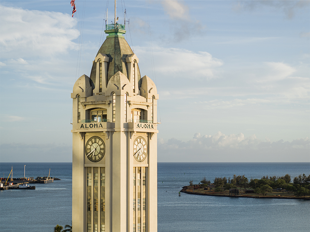
Image Border
Add different border colors on an image using the colored borders. Please refer to HPUCSS Colors for usage guides.
CURRENT SCREEN SIZE: xs sm md lg xl xxl
HTML
img src="..." class="hpu-img-fluid hpu-border-1st" alt="The Aloha Tower Teal Border"
HTML
img src="..." class="hpu-img-fluid hpu-border-2nd" alt="The Aloha Tower Light Teal Border"
HTML
img src="..." class="hpu-img-fluid hpu-border-3rd" alt="The Aloha Tower Blue Gray Border"
Image Thumbnail
Create image previews with rounded corners image thumbnails.
CURRENT SCREEN SIZE: xs sm md lg xl xxl
Rounded Image
Makes an image to appear rounded using .hpu-img-rounded. To create a perfectly rounded image, make sure to provide your image same width and height values.
In the example below, a height and width of 350px has been set. Please refer to HPUCSS Dimensions for usage guides.
Background Image with Parallax Effect
A web design technique where the background image of a section scrolls at a different speed than the foreground content, creating an illusion of depth and immersion. This enhances visual appeal and engage users by adding a subtle 3d-like motion as the page is scrolled down. Powered by Parallax.js.
The parallax container below uses .hpu-h35vp to give it 35vh container height. Please refer to HPUCSS Dimensions for usage guides.
Also, to set the background image to use to apply this effect, use the data-image-src attribute alongside the data-hpu="parallax" attribute.
Try scroll up and down to see the parallax effect in action.
HTML
div class="parallax-window hpu-h35vp hpu-d-flex flex-ai-center hpu-px-5" data-hpu="parallax" data-image-src="..." data-parallax="scroll"
div class="hpu-overlay-black hpu-p-2"
h3Parallax Demo!/h3
/div
/div
Programmatic Image Parallax
Parallax Image can also be activated programmatically with options to customize its behavior. When using this approach, simply remove the data-hpu, data-parallax, and the data-image-src attributes, define the id of your container, and call that id into your script.
HTML
div class="parallax-window hpu-h35vp hpu-d-flex flex-ai-center hpu-px-5" id="parallaxDemo"
div class="hpu-overlay-black hpu-p-2"
h3Parallax Demo!/h3
/div
/div
JS
parallaxDemonew HPU'#parallaxDemo'Parallax Options
Parallax options are also available to change its behavior:
JS
parallaxnew HPU'#imgWrap',
Parallax Method
When parallax effect is set programmatically to define options, the method defines what to do to the parallax.
JS
parallaxnew HPU'#imgWrap',
parallax();
Fluid Video Background
Enhance content with a dynamic video background to instantly establish brand tone, evoke emotion, convey context without words, or showcase a product or experience in action. This immersive visual layer adds depth and energy to web design.
Similar to image fluid, the fluid video background also resizes responsively based on its container or viewport size.
Video backgrounds can be implemented using either the iframe or video tags, depending on the source and availability. Regardless of the method, videos must be set to autoplay and muted and the video controls hidden to comply with modern browser policies.
- iframe is generally recommended when embedding videos from platforms like YouTube or Vimeo. It often results in faster load times and simpler setup, especially when using provided embed codes.
- video is more suitable for self-hosted files or when you need greater control over playback and styling.
In the examples below, both methods are demonstrated. The video background max-height is set using the utility class .hpu-max-h40vp (40vh). Please refer to HPUCSS Dimensions for usage guides.
With iframe:
HTML
div class="hpu-video-wrap hpu-max-h40vp"
div class="video-caption"
div class="hpu-d-flex flex-ai-center hpu-h100pc hpu-px-5"
p class="hpu-p-2 hpu-overlay-black display-6"The iFrame Video BG Caption/p
/div
/div
div class="video-container"
iframe class="video-bg" title="HPU Loop" src="...autoplay=1muted=1controls=0loop=1" frameborder="0" allow="autoplay; fullscreen; picture-in-picture; clipboard-write; encrypted-media; web-share" allowfullscreen/iframe
/div
/div
NOTE: If using iframe, add the title attribute and its value to explain the video in brief detail. This is for accessibility purposes.
With video:
HTML
div class="hpu-video-wrap hpu-max-h40vp"
div class="video-caption"
div class="hpu-d-flex flex-ai-center hpu-h100pc hpu-px-5"
p class="hpu-p-2 hpu-overlay-black display-6"The Video BG Caption/p
/div
/div
div class="video-container"
video class="video-bg" autoplay muted loop
source src="..." type="video/mp4"
/video
/div
/div